


Providing consumers with appropriate nutritional information is a priority in social marketing and public health policy( 1 , 2 ). Despite the priority placed on improving consumers’ information and knowledge about nutrition, consumers continue to rely on heuristics (such as categories, brand image, overall health halos) and automatic ‘fast thinking’( Reference Kahneman 3 ) to guide their evaluation of food healthiness. Past studies have found several issues affecting consumers’ use of nutrition labelling, including a lack of understanding, attention and motivation( Reference Grunert and Wills 4 , Reference Cowburn and Stockley 5 ).
To resolve the lack of attention paid to nutrition labels, as well as the lack of comprehension, several interpretive nutrition label formats have been developed( Reference Maubach, Hoek and Mather 6 , Reference Watson, Kelly and Hector 7 ). Evidence suggests that consumers’ attention to and understanding of the information presented on nutrition labelling systems is highest for formats incorporating interpretive/evaluative systems such as colour schemes compared with formats that display only numeric information such as daily amounts in percentages or grams( Reference Kelly, Hughes and Chapman 8 , Reference Malam, Clegg and Kirwan 9 ).
Colour can be an important part of making nutritional labels more interpretive/evaluative and therefore more effective in healthy food choice. For example, Schuldt found that the colour of a food label (red v. green) affects consumers’ healthiness rating of the same chocolate bar (lower v. higher) with identical energy quantities( Reference Schuldt 10 ). One colourful labelling system that has received significant attention and has been tested across several studies is the Traffic Light Signposting scheme developed by the British Food Standards Agency( Reference Hieke and Wilczynski 11 , Reference Balcombe, Fraser and Di Falco 12 ). Traffic Light labels have been shown to positively influence the ability to differentiate between healthy and unhealthy foods( Reference Borgmeier and Westenhoefer 13 , Reference Vasiljevic, Pechey and Marteau 14 ). Further, some research has suggested that Traffic Lights might not affect actual behaviour( Reference Sacks, Rayner and Swinburn 15 , Reference Sacks, Tikellis and Millar 16 ), although critics of this research have pointed to methodological issues such as contamination of the research site with unlabelled products( Reference Maubach, Hoek and Mather 6 ). Newer and more controlled field research has found that Traffic-Light-coloured labels positively influence healthful choice among individuals with low self-control( Reference Koenigstorfer, Groeppel-Klein and Kamm 17 ). Temple and colleagues found that the use of Traffic Lights increased the consumption of green-labelled foods and decreased the consumption of red-labelled foods( Reference Temple, Johnson and Archer 18 ). Similarly, Aschemann-Witzel and colleagues found that colour coding labels increased the healthiness of product choice (when consumers were reminded to make such a choice)( Reference Aschemann-Witzel, Grunert and van Trijp 19 ).
In summary, these studies suggest that colour plays a role in the understanding of nutritional label information. However: (i) it is not clear what the contextual effects are of colouring labels’ individual nutrients, independent of their objective nutritional information content. Studies on the Traffic Lights system treat colouring as a gestalt, constantly associating a certain colour with its assumed counterpart (e.g. green=healthy), thereby collapsing the effects of contextual colouring and substantive nutritional information. (ii) It is unknown whether colouring would affect consumers’ food perceptions (such as healthiness) the same way for different types of food. As we know that nutritional information about healthy v. unhealthy foods is processed differently( Reference Elbel, Kersh and Brescoll 20 ), we anticipate food category healthiness to have a moderating effect on the influence of different food label nutrient colouring schemes.
Therefore the present research aimed to fill these gaps by investigating the effect on food healthiness perceptions of different food label nutrient colouring schemes (where healthy v. unhealthy nutrients are coloured green v. red), independent of their factual nutritional information content.
Theoretical background
Inherent in visual nutrition label enhancement methods using colour (such as the Traffic Lights system) is an expectation that colour will enhance nutritional information processing and result in more accurate food health perceptions, ultimately having positive behavioural outcomes( Reference Malam, Clegg and Kirwan 9 ). To explain this overall expectation, three common approaches to colour theory are outlined to provide consonant predictions for our hypotheses. In addition, heuristic processing theory( Reference Kahneman 3 , Reference Tversky and Kahneman 21 ) is evoked to model the moderating role of healthy v. unhealthy product halos.
Colour attention theories predict( Reference Lamberski and Dwyer 22 , Reference Treisman 23 ) that the presence of colour on nutrition labels draws attention to the labels more effectively than black and white labels( Reference Lohse 24 , Reference Valiente 25 ). Further, colour association theories( Reference Labrecque, Patrick and Milne 26 , Reference McClelland 27 ) suggest that colours also possess referential meanings through learned associations. In particular, the colour green has positive associations relating to organic food, health and nature( Reference Schuldt 10 ), while the colour red has both positive (e.g. romance and passion) but predominantly negative associations (e.g. danger and warning)( Reference Elliot, Maier and Binser 28 ). Thus, in the case of food label nutrient colouring schemes, colouring healthy nutrients green should bolster healthiness associations, while colouring unhealthy nutrients red should deepen negative thoughts relating to unhealthy nutrients. Conversely, colouring healthy nutrients red should lower health perceptions, while colouring unhealthy nutrients green should diffuse negative health associations. Finally, colour approach-avoidance theories( Reference Elliot 29 , Reference Mehta and Zhu 30 ) suggest that colours also operate on the level of basic, hard-wired motivations (rather than high-level cognitive processing), such as approaching or avoiding an object (as a function of gut reactions to perceptions of danger, hunger or other basic needs). In particular, green has been shown to trigger a general approach motivation( Reference Elliot and Maier 31 ) and red an overall avoidance motivation( Reference Mehta and Zhu 30 ). Evidence suggests that the colour red does indeed result in avoidance of certain food stimuli( Reference Genschow, Reutner and Waenke 32 ). In the context of nutrient colouring schemes, this means that nutrients that are coloured red should trigger an avoidance reaction, while nutrients that are coloured green should trigger an approach reaction. Given the opposing forces predicted by different theories, schemes containing both colours simultaneously – according to either a healthy=green, unhealthy=red (HGUR) or a healthy=red, unhealthy=green (HRUG) scheme (see Fig. 1) – may result in unchanged perceptions of food healthiness, as the two opposing processes offset one another.
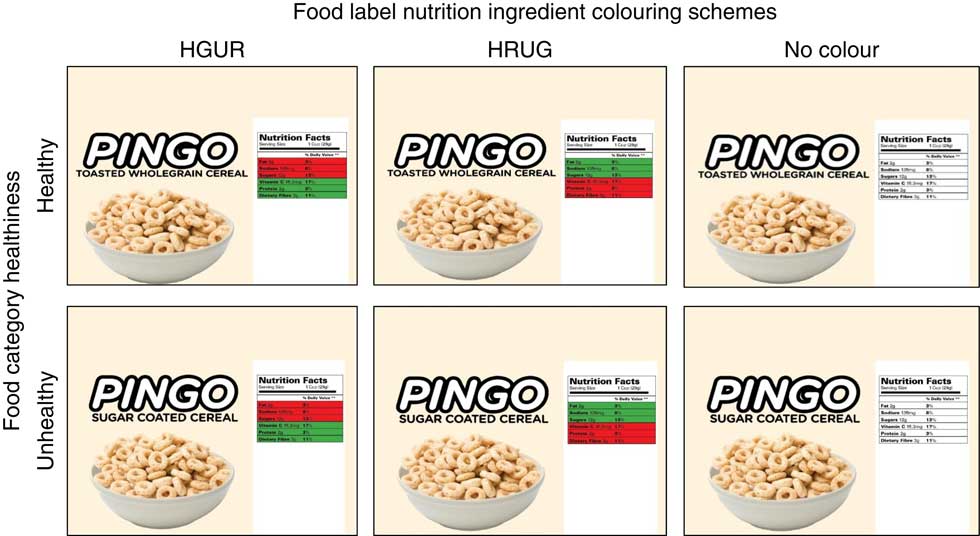
Fig. 1 Stimulus materials for the six conditions for the 2 (food category healthiness: healthy v. unhealthy) × 3 (food label nutrient colouring schemes: healthy=green, unhealthy=red (HGUR) v. healthy=red, unhealthy=green (HRUG) v. no colour) between-subjects design
However, evidence also suggests that nutritional information is subject to heuristic processing( Reference Chandon and Wansink 33 , Reference Wansink and Chandon 34 ). In our case, in particular, we anticipate that colour-influenced attention, associations and approach-avoidance operate differently under the heuristic halos of healthy v. unhealthy products. In the case of healthy products, in a HGUR colouring scheme, the association of unhealthy items with the colour red may draw disproportionate attention to these items and act as an avoidance trigger because such negative items are not expected in the halo of a healthy product. At the same time, the green-coloured nutrients may fade into the background because they are consonant with pre-existing healthiness expectations. Similarly, in a HRUG scenario, unexpected colour associations (red=healthy, green=unhealthy) may cause confusion and suspicion about the true healthiness of a product that is expected to be non-controversially healthy, resulting in avoidance. Therefore, in both colouring scenarios for healthy products, the outcome should be lowered healthiness ratings compared with when no colouring is present.
In the case of unhealthy products, a HGUR colouring scenario highlights unexpected green=healthy nutrients (increasing approach motivation), while red=unhealthy nutrients expected to be present fade into the background (decreasing avoidance motivation). The HRUG scenario with its mismatched colour associations (red=healthy, green=unhealthy) may again result in confusion, allowing for the possibility that the unhealthy product is not as unhealthy as the pre-existing halo would predict. In approach-avoidance theory terms, the unexpected approach-green signal overpowers the avoidance-red signal because it is highlighted against the overall unhealthiness expectation (a red warning is less diagnostic for a food product that is already perceived unhealthy). Therefore, in both colouring scenarios for unhealthy products, the result should be increased healthiness ratings compared with when no colouring is present.
Formally, we hypothesise that, holding factual food label nutritional information constant, the effects of nutrient colouring schemes and food category healthiness interact on consumers’ perceptions of food healthiness such that:
H1. In the case of healthy products, colouring nutrients on a food label according to (H1a) HGUR and (H1b) HRUG schemes will decrease food healthiness perceptions v. a black and white control.
H2. In the case of unhealthy products, colouring nutrients on a food label according to (H2a) HGUR and (H2b) HRUG scheme will increase food healthiness perceptions v. a black and white control.
Methods
For a pre-test, a total of seventy-two respondents (68 % male and 32 % female) were recruited from an online consumer panel. The four food products chosen for the pre-test were bread, rice, cereal and potato chips. For each product, one healthy version and one unhealthier version were selected. Participants were randomly presented with four food items and asked to rate their perceptions of healthiness of the items from ‘very unhealthy (1)’ to ‘very healthy (7)’. They were also tasked to rate eight common nutrients (protein, fat, vitamin C, calcium, sugar, dietary fibre, sodium and cholesterol) for healthiness. From the pre-test, it was determined that cereal would be the best stimulus choice for the healthy and unhealthy food items and nutrients, as there was a clear distinction between both types of cereal in regard to health perceptions. Of the food nutrients, we confirmed that consumers perceive protein, vitamin C, calcium and dietary fibre as healthy nutrients, and they perceive fat, sugar, sodium and cholesterol as unhealthy nutrients.
For the main study, a separate sample of 196 participants above the age of 18 years (males, n 82 (42 %); females, n 114 (58 %)) was recruited online. No respondents self-reported colour blindness. Respondents were exposed to treatment materials and measured on dependent variables and demographics online.
A 2 (food category healthiness: healthy v. unhealthy)×3 (food label nutrient colouring schemes: HGUR v. HRUG v. no colour) between-subjects design was used. Participants were randomly assigned to one of the six conditions. The stimulus used was an image of the back of a fictitious cereal brand’s packaging, which consisted of the product description and a nutritional label (see Fig. 1). A fictitious brand was used to avoid confounding effects arising from pre-existing brand-level attitudes and healthiness perceptions.
To allow for the capturing of heuristic processing effects, factual nutritional information was held constant across all cells (nutritional information values from an unhealthy and healthy cereal were averaged). Each nutritional label contained a total of six nutrients that are commonly found in cereals based on the pre-test. Two nutritional label versions served as control conditions, where each nutritional label was in black and white.
The ‘food label nutrient colouring schemes’ treatment was manipulated by presenting healthy nutrients in green and unhealthy nutrients in red (HGUR) or healthy nutrients in red and unhealthy nutrients in green (HRUG). Colours were held consistent by using fixed HSL (Hue, Saturation, Light) codes (red: H: 238, S: 205, L: 124; green: H: 92, S: 161, L: 100)( Reference Mehta and Zhu 30 ). The ‘food category healthiness’ treatment was manipulated by displaying the healthy product package as ‘Toasted wholegrain cereal’ v. ‘Sugar-coated cereal’ for the unhealthy product package (consumer perceptions revealed by the pre-test).
Results
A manipulation check was conducted to ensure that participants perceived the toasted cereal category to be healthy and the sugar-coated cereal category to be unhealthy. Using a scale of 1 (‘not at all healthy’) to 7 (‘very healthy’), participants were asked to rate their perceived healthiness of the product category of ‘Sugar-coated cereal’ and ‘Toasted wholegrain cereal’. One-sample t tests indicated that ‘Sugar-coated cereal’ had a mean (mean=1·93, sd=0·89) that was significantly below the middle value of ‘4’ (t(195)=30·48, P<0·001) and ‘Toasted wholegrain cereal’ had a mean (mean=5·69, sd=1·09) that was significantly above the middle value of ‘4’ (t(195)=73·33, P<0·001).
To test the study hypotheses, factorial ANOVA was performed on the mean of perceptions of food healthiness. The analysis revealed a significant main effect of food category healthiness (F (1, 195)=73·96, P<0·001, η 2 =0·169) and colouring schemes (F (2, 195)=12·29, P=0·042, η 2 =0·033) on perceptions of food healthiness. The interaction between the two independent factors of food category healthiness and colouring schemes was also significant (F (2, 195)=4·43, P=0·013, η 2 =0·045; see Table 1 and Fig. 2).
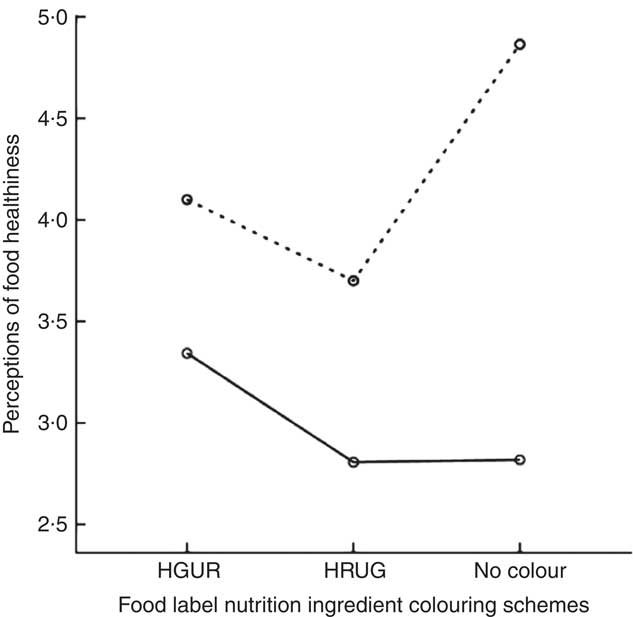
Fig. 2 Means plot for the significant interaction between food label nutrient colouring schemes (HGUR, healthy=green, unhealthy=red; HRUG, healthy=red, unhealthy=green) and food category healthiness (![]() , healthy;
, healthy; ![]() , unhealthy) on perceptions of food healthiness among 196 respondents above the age of 18 years (males, n 82; females, n 114) sourced from a national consumer panel, USA
, unhealthy) on perceptions of food healthiness among 196 respondents above the age of 18 years (males, n 82; females, n 114) sourced from a national consumer panel, USA
Table 1 Perceptions of food healthiness as a function of food label nutrient colouring scheme and food category healthiness among 196 respondents above the age of 18 years (males, n 82; females, n 114) sourced from a national consumer panel, USA

* Food healthiness was measured on a seven-point scale from ‘very unhealthy (1)’ to ‘very healthy (7)’.
† Healthy=green, unhealthy=red (HGUR): colour of healthy nutrients is green and of unhealthy ones is red.
‡ Healthy=red, unhealthy=green (HRUG): colour of healthy nutrients is red and of unhealthy ones is green.
§ The nutritional table was not coloured in the control group.
Hypothesis 1 posited that, for healthy foods, there would be a significant decrease in health perceptions of food in the (H1a) HGUR and (H1b) HRUG conditions compared with the control. Planned contrast tests revealed that there was indeed a significant decrease in perceptions of food healthiness in the both the HGUR condition (mean=4·10, sd=1·27) compared with the control (mean=4·86, sd=1·23; t(190)=−2·25, P=0·025) and the HRUG condition (mean=3·70, sd=1·58) against the control condition (t(190)=−3·43, P=0·001). Thus, the evidence was consistent with H1a and H1b.
Hypothesis 2 predicted that, for unhealthy foods, there would be a significant increase in perceived food healthiness under the (H2a) HGUR and (H2b) HRUG colouring scheme conditions compared with the control. Contrast tests revealed that there was no significant increase in healthiness ratings in either the HGUR condition (mean=3·34, sd=1·61) compared with the control (mean=2·82, sd=1·56; t(190)=1·57, P=0·119) or the HRUG condition (mean=2·81, sd=1·25) v. the control (t(190)=−0·03, P=0·973). Hence, the evidence was not consistent with H2a and H2b.
Discussion
The findings reported in the present study confirmed earlier research that colour is indeed influential in forming consumer impressions of healthiness( Reference Schuldt 10 ); however, it has contributed by demonstrating that this effect is subject to the moderating influence of product category heuristic halos( Reference Kahneman 3 , Reference Chandon and Wansink 33 ). Results show that perceived healthiness of a product has biasing influence on what role colour coding can play in healthfulness evaluations, thus importantly qualifying earlier work on colour labels’ efficacy in healthful food selection( Reference Hieke and Wilczynski 11 , Reference Balcombe, Fraser and Di Falco 12 ). In particular, the healthy cereal product tested was perceived less healthy (healthinessHGUR=4·10; healthinessHRUG=3·70; healthinesscontrol=4·86) when carrying coloured nutritional labels even when factual information was identical. It shows that although colouring nutrients may draw consumers’ attention to nutritional information, it also inadvertently lowers their perceived healthiness of the food. In contrast, perceptions of unhealthy products’ healthiness were unchanged as a result of colouring nutritional facts.
When interpreting the results, it is important to keep in mind the study’s limitations. The focal dependent variable, health perceptions, is attitudinal and thus one step removed from choice. Further, the study was based on a small convenience sample online, using a single food context. While the randomised controlled design used was a safeguard for internal validity and stimulus materials were carefully pre-tested, larger sample field experiments should replicate the results in different contexts. Finally, in an attempt to keep the design parsimonious, the stimuli used only two levels. This means the study did not test the Traffic Light Signposting scheme( Reference Sacks, Rayner and Swinburn 15 , Reference Sacks, Tikellis and Millar 16 , Reference Koenigstorfer, Groeppel-Klein and Kamm 17 ) directly (which has three values: red, amber, green) and thus results should be interpreted only in contexts where half of the nutrients is coloured in red and the other half in green. Future extensions can test how findings reported may change with the presence of middle values on both factors (i.e. amber colour and medium product healthiness).
Conclusion
The present results make an important qualification to the common belief that colour coding can only enhance the correct interpretation of nutrition information, suggesting that this incentive may not necessarily support healthier food choices in all situations.
Acknowledgements
Financial support: This research has not received financial support from any individuals or organisations other than the University of Melbourne covering data collection costs. Conflict of interest: There are no conflicts of interest. Authorship: The authors contributed equally to the design, data collection and analysis of the research. Ethics of human subject participation. The research was approved by the Ethics Committee at the Department of Management and Marketing at the University of Melbourne.


