Professor in Residence, Department of Architecture, GSD, Harvard University, Cambridge MA, USA
Policy
Open Access
Type
Essay
Section
THEORY
ABSTRACT -
The role of criticism is not to split, but rather to bring matters together in an assembly. Philosopher Bruno Latour makes the argument that the responsibility of the critic, (and, implicitly, critique), is not to divide, but instead to “offer the participants arenas in which to gather.” In light of Latour’s proposition, I will examine the generative and creative role of architectural criticism and some of the many guises under which it might take shape. I propose that the critical call of architecture is often hidden in plain sight in works that camouflage themselves under seemingly disengaged positions, and which, upon closer inspection, act as resources of architectural imagination. Specifically, I examine Saul Steinberg’s drawing “Doubling Up” (1946), the Splitnik (the American model-house showcased at the American Exhibition in Moscow, 1959), and Robert Venturi’s sign for the Grand’s Restaurant (Philadelphia, 1961-1962)
The role of criticism is not to split, but rather to bring matters together in an assembly. Philosopher Bruno Latour makes the argument that the responsibility of the “critic,” (and, implicitly, “critique”), is not to divide, but instead to “offer the participants arenas in which to gather.” 1 In light of Latour’s proposition, I will examine the generative and creative role of architectural criticism and some of the many guises under which it might take shape. I propose that the critical call of architecture is often hidden in plain sight in works that camouflage themselves under seemingly disengaged positions, and which, upon closer inspection, act as resources for architectural imagination.
To “critique” – a word whose Greek etymological root refers to judgment, but also to art – is to dissect the most intimate relationships at work in a body of knowledge. 2 Born into an architect’s family, the ancient Greek physician Galen had described the common roots of anatomy and philosophy as the act of cutting through a body or through knowledge itself. To cut through a body – architectural or otherwise – is to dissect and unfold the intricate layers of fabric that make that body. When the 1598 edition of the Florio Italian-English dictionary translated critica as an “arte of cutting of stones,” it suggested a material grounding of an act – “critique” – commonly construed as a pursuit of the mind. 3
Latour argued that “the critical mind, if it is to renew itself and be relevant again, is to be found in the cultivation of a ‘stubbornly realist attitude’… but a realism dealing with what I will call ‘matters of concern,’ not ‘matters of fact’.” 4 Following the Heideggerian distinction between “things” (such as handmade jugs) and “objects” (such as industrially produced Coke cans), he proposed to collapse the two notions and transform the “objects” into “things,” or in other words, bring together the “matters of fact” (the cans) and the “matters of concern” (the jugs). Latour described the two contradictory positions prevalent in contemporary criticism as the “fairy” and the “fact.” 5 From the “fairy” position, critics show that material entities do nothing by themselves and it is people who project onto them their own desires. On the other hand, from the “fact” position, critics show that people’s behavior is determined by exterior forces or matters of fact. Latour distances himself from the phenomenological position, which would only further reinforce the rift between objects and things, and advocates for what he calls a “fair” position in which “the critic is not the one who debunks, but the one who assembles,” 6 and, I would add, brings forth the creative role of criticism.
The first instance of an architectural critique that, I argue, nuances Latour’s position, is:
CRITIQUE AS “DISSECTING”: SAUL STEINBERG’S DOUBLING UP (1946)
Saul Steinberg’s drawing is a critical piece in that “third fair way” described by Latour that brings together “matters of fact” and “matters of concern” (Fig. 1). Moreover, it is the very act of critiquing that becomes fertile ground for the imagination.
Saul Steinberg spent the first nineteen years of his life in Bucharest, the capital of his native Romania, where he entered the university studying philosophy and letters. In 1933 he left for Milan to study architecture at the Regio Politecnico. In Italy, Steinberg built a reputation as a cartoonist for Bertoldo, a humor newspaper that welcomed young artists and writers.
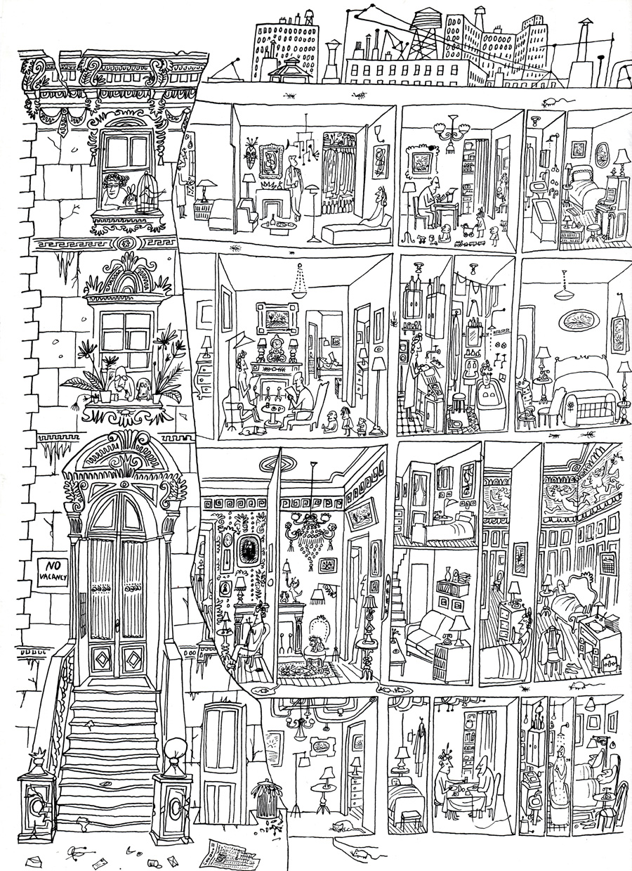
Figure 1.
1
Critique as “dissecting”: Saul Steinberg, Doubling Up, drawing first published in Architectural Forum, February 1946.
Beginning in 1938, he was subject to Mussolini’s anti-Semitic racial laws and tried to find refuge in another country. By 1941, he was sought by the police as a stateless foreign Jew with no rights to remain in Italy. On April 27, 1941 he turned himself in and was taken to the Italian internment camp of Tortoreto in the province of Teramo. After six weeks of internment, he managed to obtain the necessary visas to fly to Lisbon and board a ship to New York in transit to the Dominican Republic, for which he had a residency visa. He stayed for a year in Ciudad Trujillo before getting a US visa. He spent the rest of his life in New York City and produced a body of work that ranges from regular contributions to The New Yorker and other magazines, to gallery and museum art in a wide range of media, as well as murals, fabric designs, stage sets, and advertising art. Difficult to place under a particular movement or genre, Steinberg’s art escapes categories and reflects upon issues that cover various topics and scales from common places, stereotypes, and details of everyday life, to warfare and modern alienation. A particular feature of his art is its structure, which constructs a narrative specific to architectural works.
In 1946 Steinberg contributed four drawings over four issues of Architectural Forum. One of the drawings, originally titled Doubling Up, was reprinted later, in 1949, in The Art of Living, a collection of drawings in which Steinberg explored the many forms of domesticity and ordinary life. Doubling Up, I argue, offers an insight into what I call “architectural critique as ‘dissecting’.” Modern architectural drawing conventions would identify this piece as a sectional perspective that cuts through the building and removes a part of the front wall, which allows the observer to enter and glance into interior spaces generally inaccessible to strangers. Similar techniques of representation have been used in the past as a way to display ruins or demonstrate the multiple layers of a building. Andrea Palladio in his Second Book of Architecture draws an elevation-section of his Villa Rotonda that simultaneously shows the outside and the inside of the house. 7
Steinberg’s drawing shows the elevation of an eclectic apartment building with part of its façade stripped off. We see the steps leading to the entrance, the main door, ornate windows each framing one or more residents watching over the street. But most of the façade is removed, the building is cut wide open, thus uncovering intimate scenes of domesticity: children playing, adults sleeping, eating, drinking, bathing, reading the newspaper or knitting. There is, however, little or no interaction between them; even when more than one person inhabits the room, people are hardly looking at each other, seemingly avoiding eye contact or communication. The levels correspond to the hierarchy of the Italian palazzo: the piano nobile, higher than the other floors, exhibits heavy furniture, decorated moldings and friezes, while the basement and the two upper levels present more modest, if more “modern,” tastes. The cracks in the floor slabs allow mice and insects to colonize the unseen parts of the building. The tension between the cat in the basement and the hidden mouse about to emerge from a hole in the floor constructs a more vivid, if amusing, interaction than among humans.
A curious scene unfolds on the rooftop: the skyline seen in the background – anonymous high-rises, water towers, chimneys, and antennas – seem to be standing “on top,” rather than “behind” the building in the foreground. The remote things of the city look like scaled-down versions of themselves, objects populating the landscape of the rooftop in an avant-la-lettre Unité d’habitation. The anonymity of these distant objects hovering above the private rooms heightens the sense of alienation already present in the interior scenes, where people appear to be lonely even when sitting together at the table. Tension is building up between the attic and the piano nobile, the fragmented interiors and the impersonal skyline, the inside and the outside.
Steinberg’s drawing has inspired Georges Perec’s novel Life a User’s Manual, as well as his shorter piece “The Apartment Building.” 8 Perec observed the people, rooms, and objects in the drawing, accurately counted them, and transcribed the inventory. 9 His descriptive technique cuts even deeper into the flesh of the drawing as it sets, in fact, the premises and foundations for future stories. Steinberg has confessed multiple times that he saw himself as a writer rather than an illustrator and instead of aligning himself with the artistic genealogy repeatedly suggested by critics – Paul Klee, Willem de Kooning or Pablo Picasso – he preferred “the company of writers whom he finds far more congenial.” 10
But to come back to what I’m doing: Mine is a sort of literary work. … Where do my ideas come from? Well, it’s like what a good writer does. He writes down a word and then cancels it. Then he puts down a second word and cancels that one too. He goes on and on cancelling. … That’s how it’s done. … The problem I have is that I have to reinvent my métier practically every day, because whatever is being left behind cannot be redone, mostly because it doesn’t give me enough pleasure. The real pleasure is the invention. 11
Latour’s matters of fact, literally the “objects” of everyday life and the “characters” of everyday life, are here both matters of fact “and” matters of concern. The drawing is almost tediously descriptive, but upon a closer look the description itself has a richness and depth that fuels one’s imagination. The cracks and the mice are cracks and mice. However, the latter do not simply populate, but also gradually erode the flesh of the building. People crammed in tiny spaces have their own stories to tell, but far from exhausting them, the drawing invites the viewer to construct and complete them. The spectrum of the big city penciled on the rooftop of the building haunts the lives inside the building, rendering them insignificant. Though different, people look alike. Key to reading the drawing is the “No vacancy” sign by the entrance, which tells us about the character of the edifice – rental apartments – but also signals that inside and out the building is full of people and stuff. However, despite its fullness, it remains empty because there is no real life inside.
Almost literally cutting open the building, the drawing evokes the Late Renaissance tradition of Andreas Vesalius, who in the sixteenth century published an anatomical treatise (The Edifice of the Human Body) roughly at the same time as Sebastiano Serlio published an architectural one (The Seven Books of Architecture). Both treatises were showing the making of a body – human or architectural – and the architectural section became an anatomical dissection that revealed what was hidden behind the surface, the unseen strata of our bodies. The practice of dissecting a building is also seen in Palladio’s drawings. It proposes a simultaneous view of the inside and the outside which is not only explanatory, but, more importantly, creative, as it allows for further connections and associations to occur.
Steinberg’s drawing requires the viewer’s active imagination and critical thinking to go beyond the obvious, the banal, and the mundane, while it offers the tools to chisel the different potential narratives. Though not explicitly political, the drawing opens up questions about inhabitation, modern alienation, and estrangement, bringing together the close up and the far away, the most public and the most private, people and their artefacts.
The second instance of an architectural critique that brings forth Latour’s position, is:
CRITIQUE AS “ORCHESTRATING”: THE SPLITNIK (1959)
At the height of the Cold War, the United States and the Soviet Union decided to exchange international exhibitions that would highlight the various achievements of each country. In 1959 the Soviet exhibition opened in June in New York and the American one opened in Moscow in July. With their launching of Sputnik in 1957, the first artificial Earth satellite, the Soviets were ahead in the Space Race and felt compelled to display their scientific and technological progress. The Americans, on the other hand, chose a different approach and showcased the overwhelming abundance of consumer culture in its infinite forms. Charles and Ray Eames and George Nelson were instrumental in developing, designing, and implementing the overall concept of the exhibition, which included a dome by Buckminster Fuller (where the Eameses projected their film Glimpses of the USA on seven giant screens hanging off the geodesic structure), a glass pavilion by Welton Beckett (filled with consumer products), an architectural exhibit curated by Peter Blake, Walt Disney’s Circarama, a fashion show, a packaging exhibition, and Edward Steichen’s photography show The Family of Man.12
One of the highlights of the exhibition was a fully-furnished prefabricated house presented to the Soviet audience as an affordable option for average-earning Americans, such as veterans of World War II or steel workers. 13 The State Department hired the designer Raymond Loewy and the architect Andrew Geller to transform the original design of the architect Stanley Klein. The result was a single family, six-room house split in the middle by a corridor that allowed visitors to move through and peruse the interior. 14 Furnished by Macy’s, with appliances by GE, this cut-in-half temporary structure was dubbed Splitnik – a pun on the name of the Russian satellite and the English verb "to split" – and unintentionally provided the background for what came to be known as the “Kitchen Debate”.
Vice President Richard Nixon traveled to Moscow for the opening of the exhibition and, while walking through the split house, engaged in a political dispute with the Soviet leader Nikita Khrushchev. The Kitchen Debate took place in the kitchen of the pre-fabricated house equipped with the latest appliances intended to simplify and improve the life of the American housewife: stove, microwave, dishwasher, washer/dryer (Fig. 2). Historians have noted that the focus of the debate, which appeared spontaneous, but had been, in fact, staged by the Americans, did not revolve around lofty issues such as the scientific, industrial or technological achievements of the two nations, but rather the virtues of domestic gadgets and their impact on everyday life. 15 For Nixon, the house with its various furnishings and appliances epitomized the American Dream, freedom of choice, and the superiority of the American democracy. For Khrushchev, it was but another instance of capitalist futility, a non-sensical stage-set, and “an insult to our intelligence.” 16

Figure 2.
2
Critique as "orchestrating": The Splitnik (1959).
The Splitnik proposes another, if inadvertent, instance of Latour’s “third fair” way of critique. Physically sectioned into two parts, the house orchestrates a scene in the sense of preparing the grounds and constructing the circumstances for further events to take place. It is an ordinary house and a political statement. One of the most popularized photographs of the Kitchen Debate shows Nixon and Khrushchev leaning against the protective fence that was keeping the crowds away from the pristine model-kitchen. While the two politicians occupy the center of the image, another domestic scene unfolds in the foreground: a package opened on the table, different consumer goods on the kitchen counter, the door of the washer/dryer open as if the housewife has just stepped out of her domain. The table and the open door invite and tantalize, while the fence pushes away and restricts the access.
The architecture of Splitnik was based on a suburban house designed by the architect Stanley Klein for the home-building company All-State Properties. Documentary filmmaker Jake Gorst, the grandson of Andrew Geller, the architect who worked on the Splitnik, has identified Splitnik’s predecessor as the still-existing house at 398, Townline Road in Commack, Long Island. 17 It is not without significance that the Splitnik later inspired the design of the houses in a second-home community called Leisurama located in Long Island’s Montauk region. 18 Designed by the Raymond Lowey Corporation, the Leisurama model house was sold at Macy’s in the basement of its New York store, and – not unlike the Moscow exhibition artefact – came equipped with everything down to china and toothbrushes. 19
The Splitnik in the 1959 American Exhibition was grounded in specific historical and social circumstances and also had, if questionable, architectural consequences. Presented as a symbol of democracy, it became a consumer good and the model for worry-free, leisure houses. Essential to the viewing, the split in the middle was giving public access to intimate domesticity. The anatomical cut uncovered the physical parts of the body, its various gadgets and devices, but also American “and” Soviet dreams, the hope and desire for a life of comfort and prosperity, and an imagined better future. It did reinforce the political rift between two political regimes and their different types of propaganda, but also orchestrated the interaction between publics, consumers, media and designers. To the extent that the Nixon – Khrushchev argument was more or less improvised, the house unfolds the critical question of the accident and its relationship to the work – how can a work leave open the possibility for unplanned moments to occur?
The third and last instance of an architectural critique that brings forth Latour’s position, is:
CRITIQUE AS “RESHUFFLING”: ROBERT VENTURI’S GRAND’S RESTAURANT (1961-62)
One of Venturi and Rauch’s early projects was the remodeling of a family-owned restaurant in West Philadelphia. Catering to students, it occupied the unified ground floor of two adjacent row houses whose two upper levels were transformed into the family’s apartment. A particular feature of the place was the bearing wall separating the two original houses that was to be integrated into the new design (Fig. 3).
For Venturi the project was an opportunity to work with some of the principles he later articulated in his Complexity and Contradiction in Architecture: elements that were both functional “and” decorative (A/C ducts), ordinary “and” fancy (Thonet chairs), cheap “and” elegant (industrial lighting fixtures), modest yet carefully designed (restaurant booths). 20 The use of conventional elements in a way that made them acquire new meanings in the new context, exercised the Pop Art strategies that the architect so fondly adhered to. Venturi explicitly explored “duality” and “unification,” best illustrated through the relationship of the central bearing wall with the new layout of the ground floor and through the exterior commercial signs on the building.
Deliberately marked on the front façade, the wall separates the west side of the restaurant, which accommodates the main dining area, from the east side that houses the kitchen, services, counter and entry (Fig. 4). 21

Figure 3.
3
Critique as “reshuffling”: Robert Venturi’s Grand’s Restaurant (1961-1962).
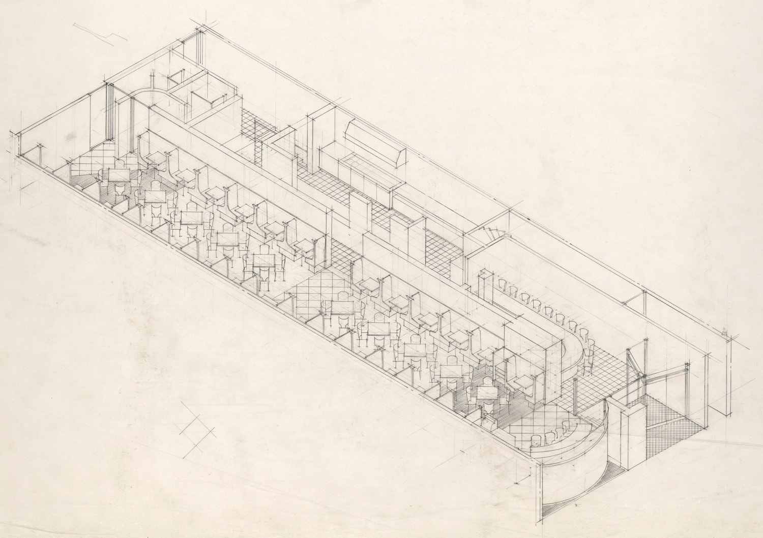
Figure 4.
4
Robert Venturi’s Grand’s Restaurant (1961-1962).
On the upper level, the wall unifies the two sides of the dwelling unit and disappears in the rhythmical row of windows. Hand-written notes on the construction documents give specific instructions for a unifying treatment of the interior and exterior surfaces:
Furnish notes. Second and third floors
- Exterior
- Scrape + paint all windows and other existing woodwork
- Front façade: paint (enamel) all brickwork
- Interior
- Remove all wallpaper
- Paint all [illegible] and plaster
- All new walls and partitions plaster except as noted
- Existing doors may be re-used 22
Venturi has traced various interpretations of "duality" throughout the history of art and architecture, from Piero della Francesca to Ellsworth Kelly. His approach to the design of Grand’s restaurant echoes his reading, published later in Complexity and Contradiction, of Louis Sullivan’s Farmers’ and Merchants’ Union Bank in Columbus, Wisconsin where
The difficult duality is prominent. The plan reflects the bisected inside space which accommodates the public and the clerks on different sides of the counter running perpendicular to the façade. On the outside the door and the window at grade reflect this duality: they are themselves bisected by the shafts above. But the shafts, in turn, divide the lintel into a unity of three with a dominant central panel. The arch above the lintel tends to reinforce duality because it springs from the center of the panel below, yet by its oneness and its dominant size it also resolves the duality made by the window and the door. 23
Following the lesson of Sullivan, the distinctive feature of Grand’s restaurant is the play between a porcelain-enameled sign at the level of the second floor that spells, while separating, the name of the restaurant (Grand’s) and an over-sized cup marking the dividing wall on the main façade (Figs. 5, 6).
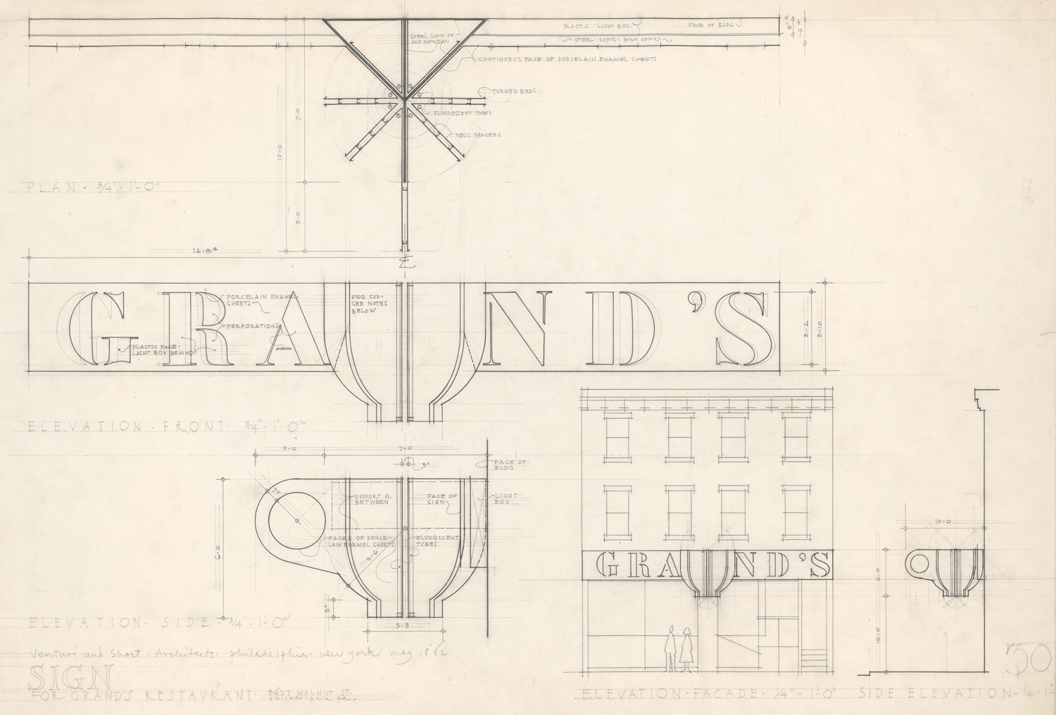
Figure 5.
5
Robert Venturi’s Grand’s Restaurant (1961-1962).

Figure 6.
6
Robert Venturi’s Grand’s Restaurant (1961-1962).
The color scheme highlights the intended duality with half of the sign blue and the other half yellow, while the cup made of colored “slices” blue on one side and yellow on the other, makes the transition between the two colors. 24 The question of signs as decoration was a recurrent one in the work of the office and also part of contemporary explorations with lettering, stencils, and the ambiguity between words and images present in the explorations of visual artists such as Ed Ruscha or Jasper Johns. As “the function of this inscription is more ornamental in nature than informative,”
The information that comes across is the “sign-quality” of the bold characters as decoration – not the name of the establishment. In this way, the sign does ultimately follow the advertising principle of making a sign difficult to read to ensure that it will be read … . 25
Later removed from the façade, the cup was re-used above the portal of New York’s Whitney Museum of American Art for the 1985 exhibition High Styles. 26
What else is there to say? Made transparent, the meanings of the work seem to have been exhausted. Everything appears to be clear. I argue that this piece accomplishes Latour’s necessary ‘third fair” way of critique despite its being over explicit and for reasons different from the obvious ones. The wall does cut open the ground floor, it does separate and expose its different functions while at the same time bringing them together. The sign on the façade does unify the two parts of the building while being itself cut in two by the oversized cup, which, in turn, marks the original dividing bearing wall (rather than the entrance), thus completing the story where it started. Andreea Mihalache The Act and Art of Architectural Critique: A Drawing, a House, and a Sign 37 However, I suggest that these are not the main reasons that make the Grand’s Restaurant intervention a critical piece. I propose that while the cup first appears as a “matter of fact,” in Latour’s terminology, a sign whose meaning is culturally determined, it also claims the territory of “matters of concern.” It questions the relationship between signified and signifier in architecture and the validity of too explicit narratives. Critique as “reshuffling,” in this case, does not infer that change in meaning occurs with the change in context or that double-functioning elements should be more present in the architectural vocabulary, to follow Venturi’s rhetoric, but rather argues for a type of architectural narrative that leaves the story open to interpretations the same way the punch-line in a well crafted joke reshuffles, at the very end, the anticipated meanings of the story. “Reshuffling,” I suggest, requires a form of critical imagination.
CONCLUSIONS
Though very different in nature as well as medium, these three pieces – a drawing, an exhibition object, and a commercial sign – show how the critical voice of architecture manifests itself as actively “dissecting,” "orchestrating," and “reshuffling” conventional meanings and interpretations. All of them show how sectioning through a body (of knowledge or architectural) is essential to critiquing, however, they all bring together, rather than separate, people and artefacts, thus accomplishing Latour’s third “fair” way that bridges the gap between “facts” and “fairies.” And it is from the bridging of the gap, from the act of assembling, that the creative role of critique emerges. “Critical architecture,” I propose, belongs as much to the territory of judging, as it belongs to the realm of imagination and invention.
Notes
1
Bruno Latour, “Why Has the Critique Run Out of Steam? From Matters of Fact to Matters of Concern,” Critical Inquiry 30, No.2 (Winter 2004): 246.
2
Oxford English Dictionary: “critique.”
3
Ibid.
4
Latour, “Why Has the Critique Run Out of Steam?,” 231.
5
Ibid., 237.
6
Ibid., 246.
7
Andrea Palladio, The Four Books of Architecture (New York: Dover Publications, 1965; or. ed.: Venice, It., 1570), Second Book, Plate 12.
8
Georges Perec, Life: A User’s Manual, trans. David Bellos (Boston: D.R. Godine, 1987) and “The Apartment Building” in Species of Spaces and Other Pieces, trans. John Sturrock (New York: Penguin, 1987), 40-45.
9
Perec, “The Apartment Building,” 41-43.
10
John Gruen, The Artist Observed: 28 Interviews with Contemporary Artists, (Chicago: A Capella Books, 1991), 170.
11
Ibid., 167-168.
12
For more details regarding the exhibition and the "Kitchen Debate," see Beatriz Colomina, “Enclosed by Images: The Eamses’ Multimedia Architecture,” Grey Room no. 2 (Winter, 2001): 5-29.
13
Richard Nixon quoted in John W. Larner, “Judging the Kitchen Debate,” OAH Magazine of History 2, no.1 (Summer, 1986): 26.
14
Justin Davidson, “The Kitchen Debate’s Actual Kitchen,” New York, May 8, 2011 – Mitchell Owens, “How a Modernist Architect Shook Up the Hamptons with Funky, Low-Cost Vacation Houses,” Architectural Digest, March 17, 2015.
15
Colomina, “Enclosed by Images,” 7-10.
16
Nikita Khrushchev quoted in John W. Larner, “Judging the Kitchen Debate,” 25.
17
Davidson, “The Kitchen Debate’s.”
18
Davidson, “The Kitchen Debate’s” and Jake Gorst’s documentary Leisurama.
19
Ibid.
20
Robert Venturi, Complexity and Contradiction in Architecture (New York: MOMA, 2002 – 3rd edition), 112-113.
21
Ibid., 112.
22
Venturi and Scott Brown Collection, The Architectural Archives, U Penn. Box 225.I.A.6107.
23
23. Venturi, Complexity and Contradiction, 88.
24
Ibid., 112; Stanislaus von Moos, Venturi, Rauch and Scott Brown: Buildings and Projects (New York: Rizzoli, 1987), 299.
25
von Moos, Venturi, Rauch and Scott Brown, 52.
26
Ibid., 299.
Acknowledgment
This essay originated as a paper presented on a session entitled “Critical Call” that was held at the 104th Annual Meeting of the Association of Collegiate Schools of Architecture in Seattle, WA, on March 19, 2016.
Credits
Figure 1. © The Saul Steinberg Foundation / Artists Rights Society (ARS), New York.
Figure 2. © AP/ANSA.
Figures 3-6. © The Architectural Archives, University of Pennsylvania by the gift
of Robert Venturi and Denise Scott Brown.
Andreea Mihalache, Ph.D., is an Assistant Professor with the School of Architecture at Clemson University. Born and raised in Bucharest, she holds a Ph.D. from Ion Mincu University of Architecture and Planning. Her scholarship has examined intersections of architecture with travel practices, photography, and mobility in the twentieth century; national identity and architecture; and dimensions of the sacred in architecture. She is currently completing a Ph.D. in architectural history, theory, and representation at the Washington-Alexandria Architecture Center. Her doctoral work focuses on allegories of boredom in mid-century art and architecture, with a focus on the work of Robert Venturi and Denise Scott Brown, and Saul Steinberg.
E-mail: amihala@clemson.edu.
Page start
25
Page end
38
Print Publication Date
June, 2017
Electronic Publication Date
Thursday, June 22, 2017