The Cyclical Sine Model Explanation for Climate Change
Article Information
D E Nierode*
Ph. D. Mechanical Engineering (1968), University of Wisconsin, Madison, Wisconsin, USA.
*Corresponding Author: D E Nierode. Ph. D. Mechanical Engineering (1968), University of Wisconsin, Madison, Wisconsin, USA.
Received: 27 October 2022; Accepted: 03 November 2022; Published: 25 November 2022
Citation: Nierode DE. The Cyclical Sine Model Explanation for Climate Change. International Journal of Plant, Animal and Environmental Sciences 12 (2022): 175-191.
View / Download Pdf Share at FacebookAbstract
The global warming/climate change underway on earth today is a totally natural occurrence caused by solar cycles with solid scientific and historical support. Earth temperatures are controlled by three solar cycles of nominally 1,000, 70, and 11 years. A supporting 73-year cycle within measured earth temperatures is documented in this work. The earth is currently in the upswing part of its normal temperature cycle. Very warm (Medieval Warming) and very cold (Little Ice Age) temperature epochs have been historically documented on earth for at least the last 3,000 years. The primary 1,000-year solar cyclicity was first estimated to be approximately every 1,500 ± 500 (1,000 - 2,000) years from many, diverse scientific studies [1]. The explanation for the earth’s temperature increases since 1850 is captured in a mathematical model called the Cyclical Sine Model. This model fits measured temperatures since 1850, past climate epochs, and correlates closely with the thousand year cyclicity of solar activity from 14C/12C ratio studies [2], Bond Atlantic drift ice cycles [3,4], sunspot history [5], the Atlantic Multidecadal Oscillation [6], and the Pacific Decadal Oscillation [7]. In addition, this model quantitively presents an explanation for the time span 1945-1975 when an impending new ice age was feared [8].
This work shows that the temperature and climate conditions currently on earth today are very similar to the earth in about 930 when the maximum temperature of the Medieval Warming epoch was still about 210 years away. The Cyclical Sine Model predicts that we are also currently 210 years away from the next maximum temperature on earth.
Measured earth temperatures for the next several years will validate either the Cyclical Sine Model or the UNIPCC model which conjectures that greenhouse gasses are controlling future earth temperatures. The near-term p
Keywords
Climate Change; Global warming; Cyclical sine model; Earth temperatures
Climate Change articles; Global warming articles; Cyclical sine model articles; Earth temperatures articles
Article Details
Nomenclature:
A = amplitude of a sine wave, deg. C; AMO = The Atlantic Multidecadal Oscillation which is the variability of surface sea temperatures in the North Atlantic Ocean; Least Squares = Sum of the squared Ri values at the regression end, dimensionless; PDO = Pacific Decadal Oscillation which is the variability of surface sea temperatures in the North Pacific Ocean; φ = phase of sine wave, radians – movement on the time axis; Ri = residual of a data point, dimensionless (Eqn. B.2); T= temperature, deg. C; t = time, years; T = period of a sine wave, years; UNIPCC = United Nations Intergovernmental Panel on Climate Change; Wi = weight factor, usually 1YCalculated; i = calculated value of temperature, deg. C; Y Observed, i = measured value of a temperature, deg. C.
1. In Measured Earth Temperature History
The world today is gripped by the threat of existential climate change. The conjecture is that the increase of greenhouse gasses in the atmosphere from burning hydrocarbons has caused increasing earth temperature approaching the point of extinction. This conjecture lacks scientific proof.
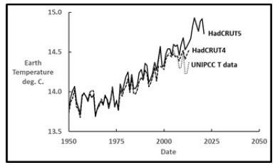
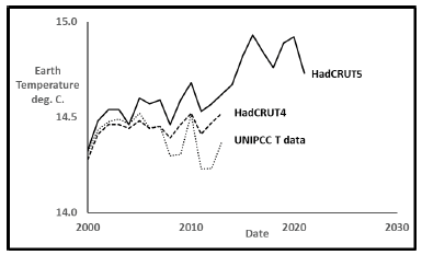
Figure 2 shows calculated annual earth temperatures since 1850 from several sources [9-11] that cover the reported range. Calculated temperature values are virtually identical until about 2000 but diverge significantly thereafter. Temperature data used for the last United Nations Intergovernmental Panel on Climate Change (UNIPCC) model 5 fit in 2014 is the lowest curve with the other profiles tending higher since the year 2000 [9]. The other two curves are from a collaboration between the Meteorological Office Hadley Centre (Had) and the Climate Research Unit of the University of East Anglia (CRU) in the UK. HadCRUT4 [10] was published in 2016 with further calculated increases published within HadCRUT5 [11] in 2020. Changes in recent temperature calculation methods are controversial with different gridding techniques, different measuring locations, and artificial increases in measured buoy temperatures being some of the controversies [12]. The UNIPCC has not issued a new and improved computer model since 2014, but instead some calculated earth temperatures since 2000 have increased to the current model’s benefit. Nevertheless, these are the earth temperature values used in this work. The 2021 measured earth temperature in the HadCRUT5 data file of 14.73°C means that earth temperature has risen 1.15°C since 1850.
Figure 3 shows a closer look after the year 2000. The UNIPCC T model 5 data [9] and HadCRUT5 [11] are used in this work to bracket the range of reported temperature profiles. I consider the original UNIPCC T data [9] from 1850 to 2013 to be the most trustworthy.
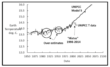
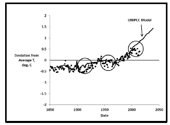
The UNIPCC has been computer modeling earth temperature history with the imperfect results so far summarized in Figure 4.
The two circles show where the model significantly overestimates measured earth temperatures with the additional interval 1998-2014 labeled the “hiatus” [13] being even worse. The UNIPCC last published their model in 2014 and have not published a new one due to substantial computation times and difficulties handling cloud effects [14]. If the UNIPCC model is ever improved to the point that it agrees very closely with measured earth temperatures, then Climate Change due to greenhouse gas buildup in the atmosphere would be scientifically proven. See Appendix A for more details.
The approach in this paper is to model the two measured earth temperature profiles and include past earth history. After the model is complete it is compared to earth science data such as solar cycles and other climatological correlations. When all this information is considered, a much better explanation for earth temperature history since 1850 results, with predicted future temperatures that are credible.
News reports often discuss the alarming evidence that earth temperatures continue increasing since 1850 with recent years “the warmest on record” [15]. The Cyclical Sne Model presented in this work shows that increasing temperatures are to be expected until the next maximum temperature in the current temperature cycle is reached. Temperatures thereafter will then decrease for about the following 500 years.
2. Additional Earth Temperature Data
The temperature values in Figure 2 are not the only information about earth’s past temperature behavior. The earth has historically been experiencing regular temperature cycles. Table 1 summarizes the past five temperature epochs [16] in recorded history. Many diverse scientific studies have observed earth temperature cycling in approximately 1,500 ± 500 (1,000-2,000) year intervals. One ice core from the Vostok glacier in Antarctica observed repeated 1,500 year temperature cycles [17] over more than 150,000 years. Other technical investigations, such as near shore sediment core analysis, studies of coral reefs, stalagmites, tree rings, iron filings, and fossilized pollen, found the same 1,500-year temperature cycles [18]. These studies infer effective or “proxy temperatures”, which are not actual measured values, but are temperature increases or decreases that explain the variations seen in their data analyses. The cause of these 1,500-year cycles is believed to be solar activity [2,18,19]. There are additional results from climatologists and oceanographers supporting the 1,500-year cycles. The Gleissberg and DeVries-Suess cycles have been combined to estimate a 1,470-year cycle [19] attributed to the sun. In addition, the Bond drift ice cycles [3,4] measured 1,000-year cyclicity.
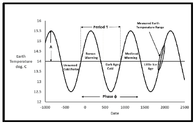
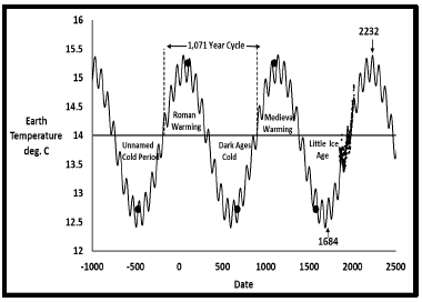
The historical temperature epochs in relation to measured earth temperatures since 1850 tie together in a way pictured in Figure 5 as a simple sine wave.
|
Epoch |
Start Date |
End Date |
Midpoint Date |
|
Unnamed Cold Period |
750 BC |
200 BC |
475 BC |
|
Roman Warming |
200 BC |
400 |
100 |
|
Dark Ages Cold |
440 |
900 |
670 |
|
Medieval Warming |
900 |
1300 |
1100 |
|
Little Ice Age |
1300 |
1850 |
1575 |
Table 1: Historical earth temperature cycles.
This is the definition of the Cyclical Sine Model. The only assumption is that the earth has behaved repetitively in past historical epochs reaching the same extremes in temperature.
3. The Cyclical Model
Cyclical behavior has long been modeled by a simple sine wave function such as Equation 1 that can be applied for temperature as a function of time.

To fit earth temperature as a function of time to this sine wave, one needs amplitude A, period T, and phase φ. Amplitude is the height of the sine wave above and below a centerline. Period is the length of the wave for a single increase and decrease cycle. Phase is the placement of the entire wave along the time axis. A computerized method called nonlinear regression finds these values by minimizing the differences between the model and data. Nonlinear regression programs try various combinations of the variables in an organized way with the goal of making the deviations between data and model as small as possible. Data points can be given different weights depending on various factors. In this work, all data points were given equal weights except the final fit, where data from 2014-2020 were given increased weights to bring them into better agreement. Many of the mathematical details about the quality of nonlinear model fits in this work are relegated to Appendix B.
3.1 Single sine fit – 1850-2013 data
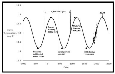
A single sine wave was fit to the measured earth temperatures and the past five temperature epochs of Table 1. Regression was done for the amplitude, the period and phase. This first regression used only the temperature data through 2013 to be on par with the UNIPCC study [9]. The regression results are shown in Table 2 and Figure 6.
|
Period, years |
1036 |
|
Amplitude, deg C. |
0.83 |
|
Phase, radians |
176.5 |
|
Data point weights |
1 |
|
Next Max Temperature |
14.83°C. in 2220 |
Table 2: Single Sine Model Parameters 1850-2013.
Every 1,036 years this heating and cooling cycle repeats itself. The last five climate change cycles in recorded history agree well in timing with this model. To the naked eye, the fit to measured temperatures looks reasonable also. The fit to the Little Ice Age, Medieval Warming, and the three other epochs in historical documents gives confidence that current earth behavior agrees with its own history. To include these historic cycles, it was assumed that at the midpoint of each epoch (Table 1), the respective maximum or minimum temperature was reached. The single large data point for each epoch is shown in Figure 6. This single sine model predicts the next maximum temperature of 14.83°C. is expected about 200 years from now in the year 2220, after a further temperature increase of another 0.24°C. From the 2013 value of 14.59°C. Total increase since 1850 would be about 1.27°C.
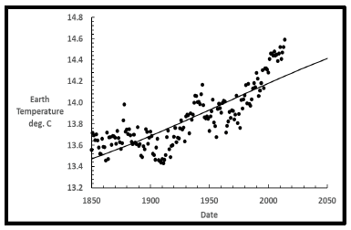
If you look closely at the measured temperatures compared to the single sine wave curve in Figure 7, it is apparent that there is another cyclical variant present. The data points in Figure 7 exhibit an oscillation above and below the single sine curve. This regular trend is a strong indication that even though the fit looks reasonable in Figure 6, improvements to the model must be made. Another sine wave needs to be added to the primary wave.
3.2 Dual sine fit 1850-2013 data
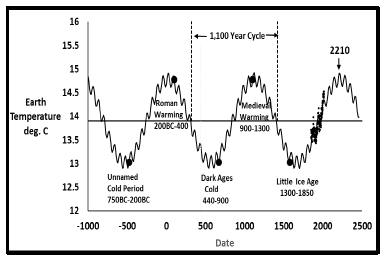
When a second sine wave is added to the first, the nonlinear regression results are shown in Figure 8. Only the original temperature data through 2013 [9] were again used. Table 3 shows the parameters for this fit where a primary period of 1,100 years was found.
|
Two Sine Model |
Sine 1 |
Sine 2 |
|
Period, years |
1,100 |
68.4 |
|
Amplitude, deg C. |
0.875 |
0.143 |
|
Phase, radians |
102 |
93.6 |
|
Data point weights |
1 |
|
|
Next Max Temperature |
14.93°C. in 2210 |
|
Table 3: Dual sine cyclical model parameters 1850-2013.
This dual sine model predicts that the earth’s temperature will increase only about another 0.34°C., which will be achieved in about 190 years in the year 2210, with a maximum temperature then of about 14.93°C. Total temperature increases since 1850 would be about 1.37°C. Additionally, the period of 1,100 years is longer, though not greatly different from the 1,036 years found by the first fit.
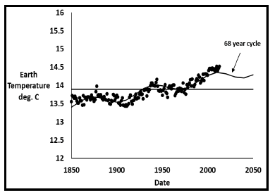
Figure 9 shows that earth temperature oscillations agree much better with the dual sine cyclical model than the single sine model in Figure 7. The second sine wave oscillation has a period of 68 years according to this fit. This oscillation does not result from the dual sine model itself. Appendix C shows that the three temperature profiles themselves oscillate about a linear trendline with periods from 66 to 73 years. The oscillation is inherent in the earth temperature data itself.
3.3 Final dual sine fit 1850-2020 data
A fit to the temperature data through 2020, with all data points equally weighted, showed that the data since 2014 deviate too much, as shown in Figure D.2 of Appendix D. To make the post 2013 data better fit the dual sine cyclical model weights for these years were increased.
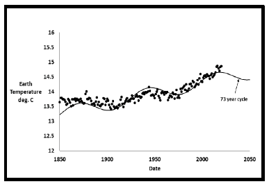
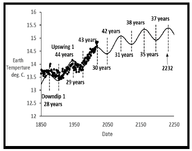
To force the 2014-2020 data into this model, the weights for those years were increased to five compared to one for the rest of the data points. This gives extra importance to recent data, assuming it is valid. The weight factor corrects for the different method of analysis of the recent data. Weights from 2 to 10 were evaluated, with the 5 weights judged to be the best compromise, with deviations for the 2014-2020 data greatly reduced, while deviations for all other data not greatly increased. Figure 10 and 11 and Table 4 show the final best fit for all temperature data. The primary solar cycle is 1,071 years with a secondary temperature oscillation of 73 years. This 73 year cycle is again inherent in the temperature data itself.
|
Two Sine Model |
Sine 1 |
Sine 2 |
|
Period, years |
1,071 |
72.7 |
|
Amplitude, deg C. |
1.264 |
0.233 |
|
Phase, radians |
1017 |
103.9 |
|
1850-2013 weights |
1 |
|
|
2014-2020 weights |
5 |
|
|
Next Max Temperature |
15.39°C. in 2232 |
|
Table 4: Dual Sine Cyclical Model Parameters 1850-2020 weights=5 for 2014-2020.
This fit is the best one can do to include the unusual increase in reported temperatures since 2013. If more consistent temperature values are ultimately reported, a final fit may not need to give the 2014-2020 data increased weight.
The net result of this final fit and those prior fits is that a nominal 70 year cycle has been found within the measured temperatures. Strong support for this discovery will be shown in later parts of this paper.
|
Start Date |
End Date |
Interval, years |
ΔT |
Type |
Sunspot |
|
Deg. C. |
Activity |
||||
|
1873 |
1901 |
28 |
0.24 |
Downdip 1 |
Minima* |
|
1946 |
1974 |
28 |
0.23 |
Downdip 2 |
Minima* |
|
2018 |
2047 |
29 |
0.256 |
Downdip 3 |
Minima |
|
2090 |
2122 |
32 |
0.319 |
Downdip 4 |
Minima |
|
2161 |
2196 |
35 |
0.415 |
Downdip 5 |
Minima |
|
* As observed |
|||||
Table 5: Earth downdips and sunspot activity.
3.4 Regular Downdip and Upswing Intervals
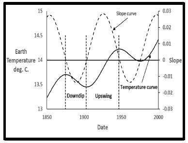
The shape of the final dual sine model curve has great significance. Each oscillation in Figure 8 and 10 consists of two parts: a downdip followed by an upswing. With the primary sinewave temperature currently increasing, temperature declines during a downdip are less than temperature increases during an upswing. These differences are due to the increasing and decreasing contributions of the secondary temperature cycle. The time interval between a local maximum and the next minimum is herein defined as a downdip, while the interval between a local minimum and the next maximum is defined as an upswing.
Figure 12 shows the first downdip and upswing since 1850. The slope (derivative) of the dual sine wave curve shown in Figure 12 as the large-dashed line is used to locate the points of zero slope on the temperature curve. The vertical small-dashed lines designate the points of zero slope bracketing downdip and upswing.
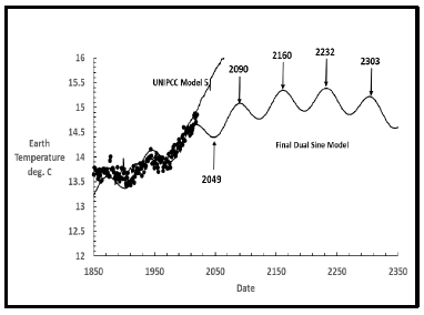
Figure 13 shows all five downdips and upswings between 1850 and the next overall maximum temperature predicted to be in 2232. Tables 5 and 6 contain the detailed values where downdips become longer as upswings become shorter. Measured earth temperatures to date closely follow this curve.
|
Start Date |
End Date |
Interval, years |
ΔT |
Type |
Sunspot |
|
Deg. C. |
Activity |
||||
|
1901 |
1946 |
45 |
0.764 |
Upswing 1 |
Maxima* |
|
1974 |
2018 |
44 |
0.751 |
Upswing 2 |
Maxima* |
|
2047 |
2090 |
43 |
0.684 |
Upswing 3 |
Maxima |
|
2122 |
2161 |
39 |
0.579 |
Upswing 4 |
Maxima |
|
2196 |
2232 |
36 |
0.463 |
Upswing 5 |
Maxima |
Table 6: Earth Upswings and Sunspot Activity.
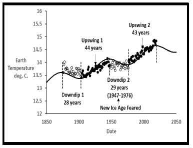
Figure 14 shows a closer look at the measured earth temperature data for the first two downdips and upswings with downdip temperatures as open circles and upswing as solid circles.
Figure 14: Two downdips and upswings since 1850.
Downdips and upswings are clearly seen, with upswings demonstrating increased temperatures, while the two downdips show declines with some scatter. Note that the period from 1945-1974, when another ice age was feared [8] possibly due to aerosols in the atmosphere, fits closely (1947-1976) with the 29-year Downdip 2 shown in the Figure 14. There is also a prior Downdip 1 from 1875-1903 that did not receive notoriety as a nonincreasing temperature interval. The final dual sinewave cyclical model predicts that we will be in Downdip 3 from 2019 until 2049.
At this point, all results presented were generated only from earth temperature data since 1850 and the reported midpoint dates for the last five historical epochs. The only assumption was that the current and past five epochs reached the same high and low temperatures. Nonlinear regression alone calculated the model parameters to make model and measured temperatures fit best. The next step is to compare the final model (Figure 10 and 11) with various earth science correlations.
3.5 Final model comparison to solar cycles
The primary 1,071-year cycle in the final dual sine model agrees closely with 14C/12C results using wavelet analyses over 11,400 years, where a primary 1,000 year solar cycle [2] was found. Additional agreement is found in the Atlantic drift ice cycles which also exhibit 1,000-year earth temperature cycles [3,4]. During temperature epochs as glaciers moved slightly from land to ocean and back, rock fragments were dragged along and later observed in subsurface cores as drift ice cycles. All the other proxy data [1] with cycles between 1,000 and 2,000 years also are consistent with 1,071 years.
The 73-year secondary oscillation in the final dual sine cyclical model correlates closely with solar sunspot cycles [5]. Sunspots have been observed [20] since 1605 with the last four centuries yielding more detailed values each month. Sunspots have nominal 11-year (11-14) Schwabe [21] cycles with large numbers of spots termed maxima when solar irradiation is somewhat increased. Similar cycles with a low number of sunspots are termed minima when irradiation is reduced. During the primary Schwabe sunspot cycle of 11 years the sun’s magnetic poles regularly reverse direction.
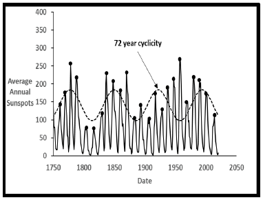
Figure 15 shows the 24 measured Schwabe sunspot cycles since 1749. With the final cyclical sine model superimposed it is seen that downdips occur during sunspot minima while upswings occur during maxima. The earth receives additional radiation during an upswing which raises earth temperature, while during a downdip temperatures stabilize or slightly decrease. This sunspot correlation with downdips and upswings affirms the counterintuitive observation that “Irradiance is greatest during sunspot maxima and lowest during sunspot minima” [20]. Figure 15 also shows predictions for future sunspot cycles (dashed line) that would be consistent with the final cyclical sine model. Cycles 25 and 26 should be minima with 27-31 maxima. NASA [22] also predicts cycle 25 to be a minimal.
Figure 16 shows that the 24 sunspot data tops of maxima and minima from 1749-2019 exhibit an approximate secondary cyclicity of 72 years in addition to the primary Schwabe [21] 11-year cycles. This 72-year secondary cycle is remarkably close to the 73-year cyclicity found within the earth’s temperature data itself. It is apparent that sunspots with their effect on solar irradiance are the direct cause of the earth secondary temperature cycles found in this work. This result affirms a prior conclusion that “70-90 years oscillations in global mean temperature are correlated with corresponding oscillations in solar activity” [23].
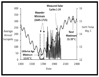
Figure 17 shows another way to display sunspot history compared to the downdips and upswings of the final dual sine model. The predicted Little Ice Age minimum temperature and the predicted next maximum temperature of the current heating cycle bracket the measured sunspot data since 1749.
All validated sunspot data since 1749 occur during the increasing temperatures between these two epochs. The line near zero prior to 1749 shows the sparce observations available since 1611 illustrating the low number of sunspots during the Maunder Minimum [24]. Note that the Maunder Minimum almost exactly occurred at the minimum temperature predicted by the final cyclical sine model. The Maunder Minimum was likely the coldest, recent earth temperature. Further implications for future sunspot activity consistent with the final cyclical sine model are shown in Appendix E.
3.6 Final model comparison to climatology
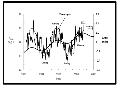
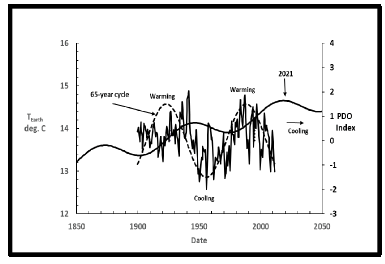
The 73-year secondary sine cycle found within the earth temperature data also correlates closely with the Atlantic Multidecadal Oscillation (AMO) and the Pacific Decadal Oscillation (PDO).
The AMO and PDO are small, ocean temperature cycles that have been measured at arctic latitudes. Figure 18 shows this close correlation with the AMO [6], which had a 69-year oscillation between 1926 and 1995.
Not only does the AMO have a similar period, but it is also in close sync with the increases and decreases of the secondary temperature fluctuations. From Figure 18 the expectation is that there would be a decreasing AMO index and cooling during the next 20 to 30 years.
The PDO index [7] also has a good correlation with the secondary temperature variations as seen in Figure 20. The PDO period was approximately 65 years (1940-2005) compared to the 73 years found in the secondary temperature oscillation. Note that the PDO is also in close sync with the increases and decreases of the secondary temperature fluctuations. It also says that in the next 20 or 30 years, cooling is expected.
In summary, the secondary temperature oscillations within the earth temperature data agree with the AMO, the PDO oscillations. All three are caused by sunspot cycles.
3.7 Surface versus lower troposphere temps
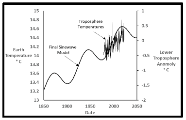
After solar radiation enters our atmosphere some of it is absorbed on land and water with the remainder reflected back into space. Land surface is heated as is the atmosphere to a lessor extent. NOAA [25] has measured lower troposphere temperatures by satellite since 1979 for use with UNIPCC models. The models do not yet predict enough troposphere heating to be consistent [26] with measured surface values. Figure 21 shows that these measured troposphere values are all during the last upswing of the sinewave model and therefore contain no information about downdips. The next few decades should show declining measured troposphere values. There is no significance to the similarity of these two curves on different scales other than both showing increasing temperatures.
Heating at the earth’s surface and lower troposphere should be proportional everything else being equal. Figure 21 shows the lower troposphere temperatures compared to the surface HadCRUT5 monthly values. The curves look quite similar on a month to month basis each having its own base temperature.
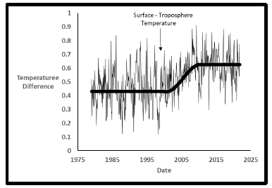
However, when the difference between these two curves is plotted in Figure 22 a jump occurs about the year 2000. One possibility is that it is due to the increased HadCRUT5 calculated surface temperatures. It appears that the lower troposphere values did not similarly increase. Other explanations have been offered [26] such as satellite instrument changes, stratosphere interference, and incorrect model data input, but none are yet proven.
This difference needs further explanation as to being a real phenomenon or an artifact of changes [12] in surface temperature calculations.
5. Future Earth Temperature Predictions
The final dual sine model and the supporting data from solar cycles and climatological correlations lead to the conclusion that earth temperatures are fully controlled by solar cycles. During intervals of sunspot maxima small increases in solar irradiation heat the earth a decreasing amount as the next maximum temperature is approached. Similarly, the intervals of minima become longer resulting in longer pauses of heating. The nominal 70 and 11-year sunspot cycles directly control the observed secondary earth temperature cycle as well as the cycles of the AMO and PDO. The nominal 1000-year solar cycle fully controls the repeated incidences of very warm and very cold epochs.
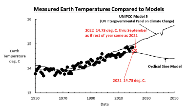
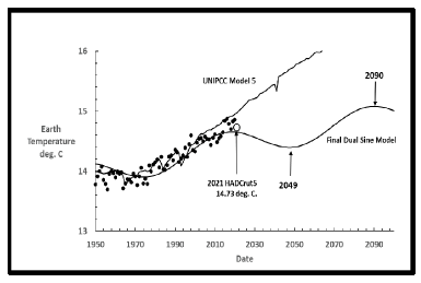
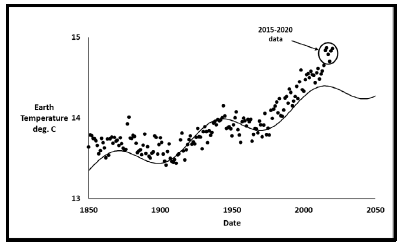
With this full solar control of the earth’s past and future temperatures the dual sine model predicts the near term earth future in Figure 23 in comparison to the UNIPCC model [9]. The predictions are quite different. The major question is whether the earth will continue to follow its historic 73-year temperature cycle shown in Figure 11 or will temperatures essentially increase in a straight line.
Figure 23 shows the near-term part of Figure 23. The large open circle is the reported temperature of 14.73°C (0.13°C. lower than 2020) for 2021 [11]. NOAA reported the 2021 temperature as 14.70°C. Year 2021 was cooler than 2020. The total temperature increases from 1850 to 2020 was 1.34°C. While from 1850 to 2021 the increase falls to 1.15°C. Through July 2022 earth temperatures are nearly identical to 2021 as seen in Table 7. The next four or five years should determine which model is the most accurate. The next maximum temperature for the final cyclic sine model should be approximately 15.39°C in 2232. The total increase in earth temperature since 1850 would be 1.81°C.
|
Month |
2020 |
2021 |
2022 |
|
January |
13.1 |
12.8 |
12.89 |
|
February |
13.3 |
12.8 |
12.91 |
|
March |
13.9 |
13.6 |
13.65 |
|
April |
14.8 |
14.5 |
14.55 |
|
May |
15.8 |
15.6 |
15.57 |
|
June |
16.4 |
16.4 |
16.37 |
|
July |
16.7 |
16.7 |
16.67 |
|
August |
16.5 |
16.5 |
16.5 |
|
September |
16 |
15.9 |
15.88 |
|
October |
14.9 |
14.9 |
14.89* |
|
November |
13.9 |
13.8 |
13.81* |
|
December |
13 |
13 |
13.03* |
|
Average |
14.8 |
14.7 |
14.73* |
|
Bold temperatures as reported *Lower case temperatures and average value as if the rest of 2022 the same as 2021 |
|||
Table 7: NOAA measured earth temperatures 2020-2022.
During approximately the next two centuries, the earth will continue to experience higher temperatures, and unusual things will happen. Areas away from the equator will experience increased migration, and food production will migrate to those areas. Plants, animals, and every other living thing will experience many of the changes mankind lived through in a period known as the Medieval Warming. Then, a warm, inviting place called Greenland was discovered by the Vikings, who grew crops there to feed their animals [27]. The Vikings were forced to abandon Greenland after about 365 years due to the advance of the Little Ice Age.
After our current warming, the earth will cool and experience a very cold period, like The Little Ice Age when the Thames River in London froze solid at least 23 times [28] and has not done so again since 1814. Londoners held “Frost Fairs” on solid ice with even an elephant walking across. The good news is that we now have huge, proven amounts of energy for use during very warm and very cold periods.
5. Conclusions
The information presented in this paper has led the author to conclude the following:
- Earth’s temperature increase since 1850 and its past temperature epochs were caused and controlled by three solar cycles nominally of 1,000, 70, and 11 years. A new 73 year cycle has been found within the measured Earth temperature data itself that correlates with sunspot history.
- The earth will experience sunspot minima for the next two 11-year Schwabe solar cycles 25 and 26, causing moderate cooling (non-increasing) earth temperatures during that time interval. Later sunspot cycles 27-31 should be maxima leading to increased earth temperatures.
- The next maximum earth temperature of 15.39°C should be reached in approximately 210 years. Total temperature increase since 1850 would be 1.81°C.
- The interval from 1945-1975, when an impending ice age was feared, is explained as a downdip zone in the dual sine cyclical model.
- The temperature epochs during future millennia for planet earth will require abundant energy sources to maintain livable temperatures everywhere during extremely hot and very cold future cycles.
References
- Fred S, Avery S, Dennis T. Unstoppable Global Warming – Every 1500 Years, Rowland & Littlefield Publishers, Inc. (2008): pp: 61-68.
- Ma LH. Thousand-Year Cycle Signals in Solar Activity. Solar Phys 245 (2007): 411-414.
- Bond G, Showers W, Cheseby M, et. al., A Persuasive Millennial-Scale Cycle in North Atlantic Holocene and Glacial Climates, Science 278 (1997): 1257-1266.
- Obrochta SP, Crowley TJ, Channell JET, et al. Climate variability and ice-sheet dynamics during the last three glaciations, Earth and Planetary Letters 406 (2014): 198-212.
- Sunspot Number Data | NCEI, https://ngdc.noaa.gov/stp/solar/ssndata.html
- NOAA AMO, https://psl.noaa.gov/data/timeseries/AMO/
- NOAA PDO, https://psl.noaa.gov/data/correlation/amon.us.long.data
- Time Magazine. Another Ice Age? (1974): 86.
- United Nations Intergovernmental Panel on Climate Change (2014), https://unfccc.int/topics/science/workstreams/cooperation-with-the-ipcc/the-fifth-assessment-report-of-of-the-ipcc.
- Met Office Hadley Centre observations datasets, HadCRUT4 (2016), https://www.metoffice.gov.uk/hadobs/hadcrut4/data/current/time_series/HadCRUT.4.6.0.0.annual_ns_avg.txt
- Met Office Hadley Centre observations datasets, HadCRUT5 (2020), https://www.metoffice.gov.uk/hadobs/hadcrut5/data/current/download.html
- Explainer: How data adjustments affect global temperature records (2017), https://www.carbonbrief.org/explainer-how-data-adjustments-affect-global-temperature-records
- Los Angeles Times. Detailed look at the global warming ‘hiatus’ again confirms that humans are changing the climate (2017).
- Robert Lee H. Climate Scientist Encounter Limits of Computer Models, Bedeviling Policy, WSJ (2022).
- Top 10 Warmest Years on Record | Climate Central, https://www.climatecentral.org/gallery/graphics/top-10-warmest-years-on-record
- Singer SF, Avery DT. Unstoppable Global Warming – Every 1500 Years, Rowland and Littlefield Publishers, Inc., (2008): 39-59.
- Lorius C, Jouzel J, Ritz C, et al. A 150,000-year climatic record from Antarctic ice. Nature 316 (1985): 591-596.
- Singer, S. Fred, and Avery, Dennis T., Unstoppable Global Warming – Every 1500 Years, Rowland & Littlefield Publishers, Inc., (2008): 29-38.
- Braun H, Christl M, Rahmstorf S, et al. Possible solar origin of the 1,470 year glacial climate cycle demonstrated in a coupled model, Nature 438 (2005): 208-211.
- The Sun and Climate. U.S. Department of the Interior and U.S. Geological Survey. USGS Fact Sheet FS-095-00 (2000).
- Schwabe Samuel Heinrich. Observations of the sun in the year 1843, Astronomische Nachrichten (in German) 21 (1843): 233-236.
- What will solar cycle 25 look like? (2020).
- Lassen K. Long-term Variations in Solar Activity and their Apparent Effect on the Earth’s Climate. Energy & Environment 9 (1998): 727-739.
- Eddy JA. The Maunder Minimum, Science 192 (4245): 1189-1202.
- NOAA Climate Data Record for Mean Layer Temperature (Lower Stratosphere) from UCAR.
- Hausfather, Zeke Study: Why Troposphere warming differences between models and satellite data. Global Temperature (2017).
- Lamb HH. Climate, History and the Modern World, Psychology Press (1995): 187-189.
- Mark D. Thrills of the frost fair: Fascinating paintings and memorabilia show how Londoners celebrated when the River Thames froze over, Daily Mail (2013).
- Bates DM, Watts DG. Nonlinear Regression Analysis, Its Applications, John Wiley & Sons, Inc, (1988).
- Dyson F. A Meeting with Enrico Fermi. Nature 427 (2004): 297.
Appendix A: UNIPCC Model 5
The United Nations Intergovernmental Panel on Climate Change (UNIPCC) has been working since 1985 to model earth temperatures by including every climate event that happened since 1850 in a model of the whole Earth and its atmosphere. The model breaks the earth surface and atmosphere into 3-D volumes with each element experiencing its own history. Then the results are summed each year to yield a calculated earth temperature for comparison to the measured value. The last UNIPCC modeling results were published [9] in 2014 with the comparison to Earth temperatures shown in Figure A.1.
The extreme detail that is included in the model should lead to very close agreement with the data except for random error. Nevertheless, it is seen that the agreement between data and model is not very exact. The three intervals highlighted by circles show that the model significantly overpredicts measured temperatures. The most alarming one is the interval from 1998-2014 when temperatures leveled off [13] instead of increasing as the model predicted. This was when the term global warming was deemphasized in favor of climate change because the Earth did not warm as expected. Nonlinear modeling is discussed in Appendix B where a result like Figure A.1 requires resolution of inconsistencies before any prediction into the future is credible. To date the UNIPCC has not yet issued an improved model since 2014. If much closer agreement is achieved by the next model, then the result can be considered proof of what is causing increasing Earth temperatures. If the buildup of greenhouse gasses is the root cause, then the model and data should agree closely. To date this agreement has not been achieved.
Appendix B: Nonlinear Regression
Scientists and engineers often have data in need of interpretation for basic understanding of what the data mean, and to ultimately extrapolate the meaning into the future. Mathematical modeling plays the main role in quantifying the information in an organized manner. The obvious requirements to do modeling are:
- You must have data before constructing a mathematical model.
- Your model must very closely quantify the data.
- In the absence of either one, you do not have an adequate model.
Nonlinear regression of data started [29] in the early 1950’s when computers became fast enough to perform the many thousands of iterations necessary to arrive at the final answer. Early programs were entered by IBM paper cards and required a liquid nitrogen cooled Cray computer to complete the calculations. Today the same calculations can be done on a laptop computer using a regression program such as Solver in MS Excel.
Nonlinear regression is NOT able to give any answer that the user desires. The data itself contains a story that is revealed by nonlinear regression. It is not possible to select a set of parameters for real world data as John von Neumann famously said, “With four parameters and I can fit an elephant, and with five and I can make him wiggle his trunk” [30]. I expect that von Neumann would agree that his muse is not correct for real data analysis today. The data speaks for itself.
Non-Linear Mathematical Models
Nonlinear models are difficult to successfully apply to complex data sets. Most behaviors of earth systems are nonlinear, as are physical phenomena such as the failure of structures. Nonlinear modeling is now a well-established, mathematical activity.
Models can be any type of algebraic or computer equation with dependent and independent variables to describe the data. For example, one might have Earth average, annual temperature values as the dependent variable with cloud cover, CO2 concentration in the atmosphere, and rainfall as independent variables, among others. The UNIPCC modeling effort is to quantify all the phenomena occurring everywhere on the surface of the earth from 1850 to the present time. The hope is that if you correctly model all the many pieces, when you put them together you will replicate the Earth’s temperature history. Their models are so complex and costly to run that they are unable to do any fitting of individual block information using the nonlinear regression method explained next.
Non-Linear Regression
Nonlinear regression is a computerized method by which observed data are fit to a nonlinear function that has some parametric values that are not closely known. The data are fitted by one of several methods of successive approximations to find the best value of the parameters, the regression parameters. If the model has sufficient capability to completely reproduce the character of the data, the result is a best fit, which often confidently predicts behavior beyond the range of the data.
Several regression methods are termed Gauss-Newton, Gradient Descent, and Levenberg-Marquardt, among others. Each starts with a user supplied estimate of the regression parameters and makes successive changes to the parametric values, leading to a least squares final fit. A least-squares fit minimizes the sum of the squares of the residuals in eqn. B.1. When the sum of squares is minimized, differences between the model and data are the best possible fit for that model.

Ri is called the residual of a data point. It is the fractional difference between calculated and observed values as a fraction of the observed value. Wi is a weight factor that can be assigned to give more credence to certain points. For example, more accurate values that are based on improved measurement methods. The residuals are squared in the sum of squares to be minimized by nonlinear regression so that positive and negative residuals are treated equally. If not squared, a large negative residual and a large positive residual would merely cancel each other out, giving a misleading result. With most data being measured in some way, there are always measurement errors termed random errors. Measuring equipment or personal observations of some events always introduces some uncertainty. The nonlinear regression program used in this work was the Solver in MS Excel 365.
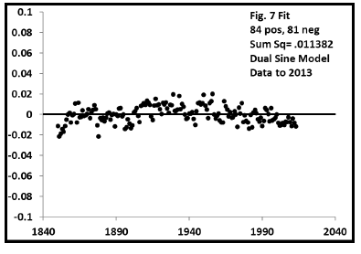
The quality of nonlinear models is not only assessed by visually comparing model predictions with measured values. The residuals of eqn. B.2 are studied for low values and irregular trends. Whenever data is measured by machine or personnel errors can result. These are referred to as random errors. Being random means that when on plots residuals regular trends should not occur if the model is valid. Also, there should be about and equal number of negative and positive residuals if they are truly random.
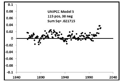
Residual plots of the various model fits in this work are shown next. The residuals for the UNIPCC Model 5 fit in Figure B.1 are mostly positive meaning that the model overpredicts the measured temperatures too much. This means that the model needs to be altered to greatly improve the fit with nearly equal positive and negative residuals.
The initial dual sine fit to the 1850-2013 data in Figure B.2 shows a nearly perfect residual trend with no regular trend and nearly equal positive and negative values.
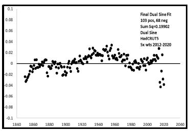
The final fit of Figure 9 and 10 in Figure B.3 shows somewhat of a trend with more positive than negative residuals. This is due to the unusual Earth temperature values since 2013 that were given extra weight to force their inclusion in the model. If these temperatures are later modified to be more regular, the residuals should return to a much better fit.
Appendix C Cyclicity Inherent in Earth T Data
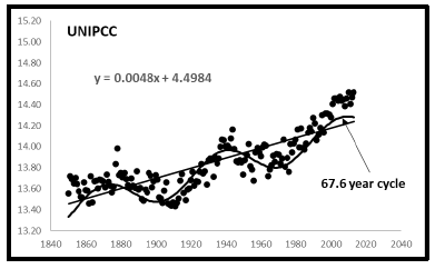
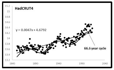
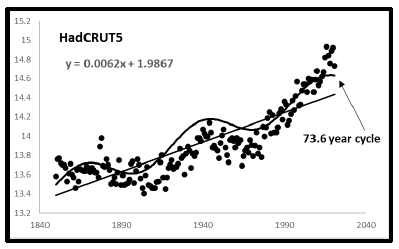
All three of the temperature data sets in Figure 1 have within themselves an inherent cyclicity about their linear trendlines as shown below.
It is seen that all three of the prospective temperature data sets exhibit within themselves yearly cyclicities from 66.6 to 73.6 years. Earth temperatures themselves reveal cyclicity in agreement with the broader analysis presented in this paper.
Appendix D First Dual Sine Fit to 1850-2020 Data
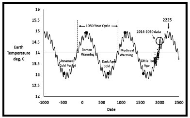
When the same analysis as Figure 6 and 7 is done including the additional temperatures [8] from 2014-2020, the nonlinear regression results are shown in Figs. D.1 and D.2.
Each temperature value was equally weighted. The 2014-2020 data do not fit very well. There are different characteristics in these data, as already discussed in Fig. 2. Table D.1 shows the resulting parameters for this fit.
|
Two Sine Model |
Sine 1 |
Sine 2 |
|
Period, years |
1050 |
71.7 |
|
Amplitude, deg C. |
0.97 |
0.162 |
|
Phase, radians |
101.4 |
101.7 |
|
Data point weights |
1 |
|
|
Next Max Temp |
15.03°C. in 2225 |
|
Appendix E Future Sunspot Predictions
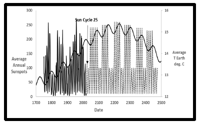
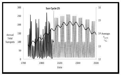
Future sunspot behavior that would be consistent with the final dual sine cyclical model is shown in Fig E.1.
Current sunspot 25 is predicted to be “feeble” just like 24 with a value of 115 in 2025 [20]. The future sunspot maxima values shown are very approximate with total sunspot numbers increasing until 2232 and afterward decreasing. Such behavior would be consistent with slightly increasing solar irradiance followed by reductions after the next maximum earth temperature in 2232. Sunspots should be minimum for cycles 25-26 during the next downdip from 2019-2049. Figure E.2 is a plot like Figure E.1 from the final dual sine results in Figure 7 with temperature data only from 1850-2013.
It is seen that the agreement here is slightly better with solar cycle 24 just at the beginning of the downdip whereas in Figure E.2 it is slightly before the end of an upswing. This sheds a little bit of doubt on the Earth temperature data from 2014-2020.

 Impact Factor: * 3.6
 CiteScore: 2.9
  Acceptance Rate: 11.01%
  Time to first decision: 10.4 days
  Time from article received to acceptance: 2-3 weeks